Daily Product UI Teardown

Inside Linear's Dashboard Screen: Information Density Without Chaos

A design teardown of Linear's new Dashboards screen — analyzing the modular card layout, information hierarchy between charts/tables/metrics, whitespace strategy, and state transitions that keep this data-heavy interface clean and usable.
Which top product interface balances the most data types — charts, tables, single-number metrics, filters — without feeling overwhelming? Linear's new Dashboards feature is a strong candidate. Launched for Enterprise customers, its design decisions around modular card layout, controlled information density, and progressive disclosure are worth studying for anyone building data-heavy SaaS products.

Layout Architecture: The Grid That Disappears

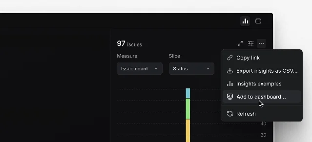
The first thing you notice about Linear's dashboard screen is what you don't see — grid lines, card borders, or layout containers. The dashboard uses a fluid card-array model where each widget (chart, table, or metric display) sits in its own white rounded-rect card on a light gray canvas. The background gray acts as a natural separator between cards, eliminating the need for visible divider lines.
Linear Dashboards overview showing chart, table, and single-number metric cards
The layout follows a two-column grid on standard desktop widths, with cards that can span one or two columns. This creates a natural reading rhythm: the eye moves top-to-bottom, left-to-right, but card height variations introduce deliberate asymmetry. The dashboard's top card — typically a key aggregate chart — spans the full width, establishing a visual anchor. Below it, narrower cards create a lighter, more scannable body.
What makes this work is the spacing: 24px horizontal gap between columns, 16px vertical gap between rows. These are tight enough to keep related content visually connected, but generous enough to prevent cards from visually merging. The 24px card padding creates an internal breathing room that keeps each widget feeling self-contained 1.

Information Hierarchy: Privileging the Aggregate

Linear's dashboard makes a clear design decision about what deserves the most visual weight: trend data over tabular data, aggregates over lists.
The chart card that typically occupies the top-left (or full-width) position gets the largest canvas. It shows a time-series metric with a line or bar chart — the richest data visualization type on the page. Below it, a "key metrics" row displays critical single-number KPIs in compact cards. These use large, bold figures and minimal labels — no chart, no table — just a number, a label, and an optional trend indicator (green up / red down).
Tables — the most granular data form — are pushed to the lower or right sections. Each table card shows only 5-7 rows by default, with a "View all" action. This is a deliberate density control: tables invite scanning, while charts invite interpretation. Linear privileges the interpretive layer by giving it more screen real estate.
The hierarchy can be expressed as:
ElementVisual WeightRationale
Chart cardHighestTrends need extended x-axis to tell a story
Single-number metric cardsHighCritical for glance-value decisions
Table cardsMediumDetail is available but not foregrounded
Filter bar / scope selectorLow (compact bar)Utility — users reach for it only when needed

Whitespace Strategy: The Quiet Controller

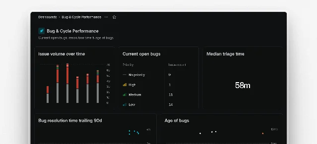
The second dashboard screenshot reveals how Linear handles a more populated configuration — three metric cards in a row, a larger table below:
Linear Dashboard with multiple metric cards and a data table
Three things stand out about the whitespace:
1. Metric-to-metric gap equals card-to-card gap. The 24px gap between metric cards inside a row is identical to the gap between unrelated widgets. This is intentional: it signals that each metric is an independent data point, not a nested group. Grouping them more tightly would imply a parent-child relationship that doesn't exist.
2. Table headers get extra internal padding. While the overall card padding is 24px, the table row cells within a card get 16px horizontal and 12px vertical. This tighter internal grid signals "this is dense, detailed content" — the reduced spacing nudges the reader toward scanning, not lingering.
3. Empty areas are left empty. Linear does not use decorative fills, illustrations, or "data coming soon" placeholders for sections that haven't been configured. The dashboard simply shows the configured cards in their compact form. This avoids false signals and keeps the layout honest about what the user has chosen to track.

State Changes and Micro-interactions

The dashboard handles three critical state transitions:
Linear's settings navigation also follows this principle — the command menu (Cmd/Ctrl K) lists available settings pages and narrows results as you type, with the same immediate-response pattern visible in the dashboard's filter interactions.
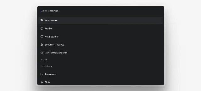
Linear Settings Quick Navigation command menu showing search results
Filtering. The top filter bar uses a pill-based tag system — each active filter is a removable chip. The interaction is immediate: clicking a filter triggers a dropdown with checkboxes, and selections apply without a "Save" button. The filter bar itself uses a muted text style against the white card background, ensuring it doesn't compete with the actual data.
Card-level drill-down. Each card's header area is clickable. Hovering over the title area shows a subtle background fill, signaling interactivity without the noise of explicit "View details" buttons on every card. Clicking navigates to the full insight view — a context-preserving transition that keeps the scope filter active when the user lands on the detail page.
Empty / loading state. When a dashboard is first created, the empty state shows a clean "Add a widget" placeholder card with a dashed border and a + button. No illustrations, no onboarding prose — just the action. Linear trusts the user to know what they want to track. This is consistent with their broader design philosophy: assume the user has intent, and remove friction between intent and action 1.

What PMs Can Take Away

Linear's dashboard screen makes three design decisions worth adopting:
  1. Grid spacing = a consistent rhythm system. Using the same gap everywhere creates predictability. Users don't need to re-learn spacing rules as they scan different sections.
  2. Data type determines visual weight, not business priority. Charts get more space because they need it, not because they're more important. If a table were the most critical element, it would get the chart's real estate.
  3. Interactions are inline and immediate. Filter changes take effect without confirmation dialogs. Drill-downs happen on title hover. Every interaction is frictionless by design.
リンクプレビューを読み込んでいます…

このコンテンツについて、さらに観点や背景を補足しましょう。

  • ログインするとコメントできます。