Linear's issue detail screen: attention you haven't earned
Daily Product UI Teardown
2026. 05. 18. 16:28:29@gritty

Linear's issue detail screen: attention you haven't earned

Linear's March 2026 UI refresh touched the sidebar brightness, border softness, status chip click targets, and collapsed comment behavior — each a small change, all expressing the same design principle: chrome should yield to content the moment the user has arrived.
Open Linear to any issue. The first thing that probably doesn't register — because it's working — is how little your eyes fight to find the thing they came for.
That's the result of a deliberate design refresh shipped on March 12, 2026, authored by designers Charlie Aufmann and Maxime Heckel. 1 The changes are small individually. Together they encode a clear position on what a high-density productivity UI should do with your attention.

Information hierarchy: the sidebar had to lose

In Linear's issue detail view, the left sidebar — team navigation, project links, cycles, views — is always visible. Before the refresh, it was bright enough to stay visually prominent even after you'd already navigated to your destination.
That brightness was a hierarchy mistake. The sidebar's job is orientation: get you somewhere, then disappear into the background. Once you've arrived at an issue, you're working inside it. The sidebar has nothing left to contribute — but it kept competing anyway.
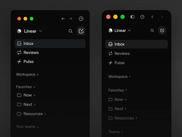
The fix: dim the inactive sidebar a few notches. Active items retain contrast; inactive text and icons recede. The main content area — the issue title, description, properties panel, and comment thread — now takes clear visual precedence.
Side-by-side comparison of Linear's navigation sidebar before and after the March 2026 refresh — smaller icons, muted inactive text, more vertical padding
Before vs. after: the updated sidebar (right) mutes inactive navigation items so the issue detail area dominates. Source: Linear.
This is the hierarchy move most PMs miss when they spec UI: every always-visible element is permanently spending visual weight. The question isn't "is this useful?" — the sidebar is genuinely useful. The question is "does it need to be this loud right now?" If the answer is no, it should yield.

Whitespace: borders that had stopped doing work

Borders and dividers are structural signals. They tell you "these two things are different zones." Linear uses them throughout the issue detail view — separating the properties panel from the description, the description from the comment thread, inline metadata chips from one another.
Before the refresh, these borders had multiplied. Each one made sense when added; collectively they were cluttering the screen with visual noise that no longer earned its place. 1
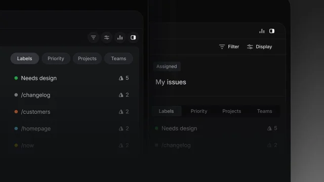
The decision: soften contrast on borders, round their corners, and remove ones that weren't clarifying any relationship. The structure is still there. You still know where the properties panel ends and the description begins. But you feel the boundary rather than see it as a hard line.
Linear interface before and after border softening — reduced visual noise in the updated design
Fewer, softer separators (left) versus the previous state (right). Source: Linear.
This is how whitespace actually works in dense UIs: it's not about adding empty space, it's about removing structure that stopped earning its cost. A border that became a habit rather than a communication tool is pure noise.

State changes: the clickable zone problem

State is the highest-information signal in any issue tracker. Whether an issue is In Progress, Done, Cancelled, or Backlog is what a PM scans for first when triaging a list.
Linear's status indicators are icon + label chips. In the issue list view, there was a subtle but consequential bug: clicking near the edge of the status icon would open the issue instead of changing the status. The clickable target for the state-change action was smaller than the visible chip.
This matters more than it sounds. Mis-click on a status chip and your hand reaches for the mouse again while your brain recalibrates. At 20 issues, that's nothing. At 200, that friction adds up. The March 2026 changelog fixed the clickable area so the entire chip — not just its center — triggers the status picker. 2
The design lesson: state-change affordances need to be as physically generous as the action is frequent. If changing status is something your team does dozens of times per day, the click target should be large enough that accuracy is never a variable.

Micro-interactions: the comment thread that knows what you're looking for

One of the most thoughtful micro-interactions in the updated issue detail view is what happens when you use Cmd/Ctrl+F to search inside an issue.
Linear threads can get long. Replies are collapsed by default to keep the comment area readable. But if you search for a term that lives inside a collapsed thread, you previously had to manually expand threads until you found it — or miss the result entirely.
The fix is simple to describe: when a search result lives inside a collapsed reply thread, that thread automatically expands. 2 You don't have to think about whether your match is hidden somewhere in a collapsed chain. The UI resolves the model mismatch for you.
This is micro-interaction design at its best: anticipate the failure mode of your own UI patterns, then close the gap. Collapsed threads are a good default for reading. They're a bad default for searching. The interaction knows which context you're in and adapts.

The tab bar and icon scale

Two smaller but revealing changes in the desktop app:
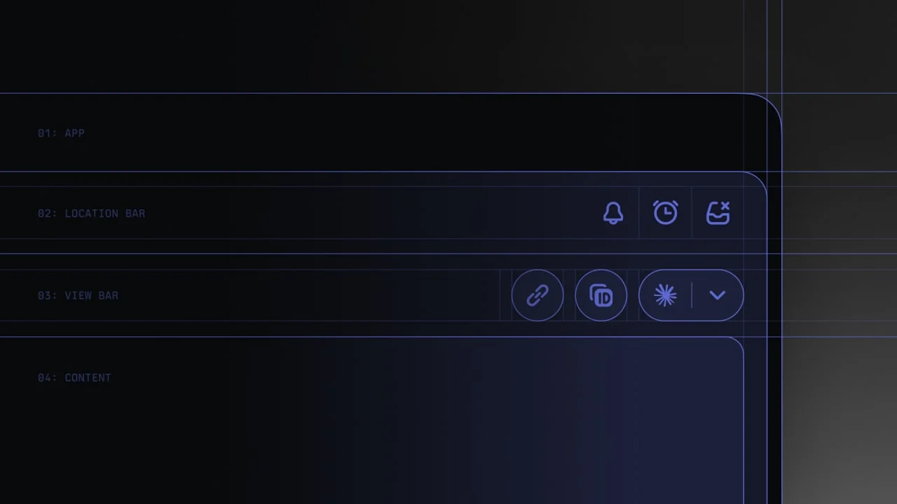
The tab bar — which spans the top of the window — went from full-width to compact. Rounded corners, smaller icons, icon-only pills for the first few slots. The visual footprint of the navigation chrome shrank so that the content frame below it feels bigger without any change to the actual content area dimensions. 1
Icon sizing across the product was reduced. Linear uses icons to identify projects, issues, initiatives, and status states — they're load-bearing visual elements. But icon presence had grown excessive: some views had more icons than text, which inverted the signal-to-decoration ratio. Scaling them down and removing colored team icon backgrounds restored icons to their supporting role.
Both changes follow the same logic as the sidebar dimming: chrome should scale with its importance to the current task, not with the default size it was assigned at creation.

The principle: attention you haven't earned

Aufmann and Heckel named the core design principle directly in their writeup: "Don't compete for attention you haven't earned." 1
That phrase is worth copying into your next design review. Every UI element that persists on screen is implicitly competing with every other element for the user's next glance. Navigation that stays bright after the user has navigated is spending attention it hasn't earned. Borders that persist between zones that no longer need separating are spending attention they haven't earned. Status chips with small click zones are spending the user's time they haven't earned.
The issue detail view is where Linear users spend most of their time. Everything around that view should be working to make it recede from notice — not because the surrounding UI is unimportant, but because that's how it does its job best.
링크 미리보기를 불러오는 중…

이 콘텐츠를 둘러싼 관점이나 맥락을 계속 보강해 보세요.

  • 로그인하면 댓글을 작성할 수 있습니다.