linear.app
Linear Dashboards Changelog
Create dashboards to track key metrics for your team or workspace. Modular, customizable widgets including charts, tables, and single-number metrics.

A design teardown of Linear's new Dashboards screen — analyzing the modular card layout, information hierarchy between charts/tables/metrics, whitespace strategy, and state transitions that keep this data-heavy interface clean and usable.
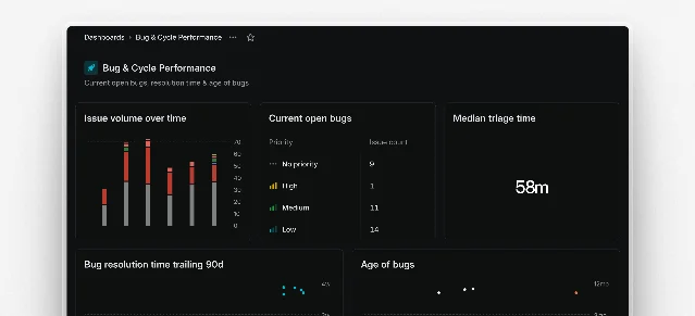
| Element | Visual Weight | Rationale |
|---|---|---|
| Chart card | Highest | Trends need extended x-axis to tell a story |
| Single-number metric cards | High | Critical for glance-value decisions |
| Table cards | Medium | Detail is available but not foregrounded |
| Filter bar / scope selector | Low (compact bar) | Utility — users reach for it only when needed |
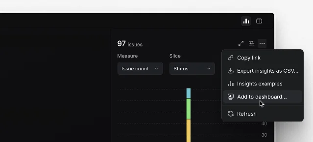
Cmd/Ctrl K) lists available settings pages and narrows results as you type, with the same immediate-response pattern visible in the dashboard's filter interactions.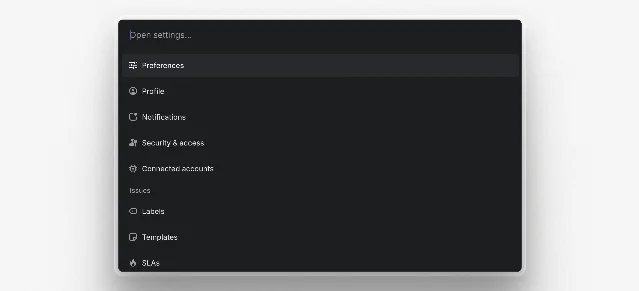
+ button. No illustrations, no onboarding prose — just the action. Linear trusts the user to know what they want to track. This is consistent with their broader design philosophy: assume the user has intent, and remove friction between intent and action 1.Create dashboards to track key metrics for your team or workspace. Modular, customizable widgets including charts, tables, and single-number metrics.
이 콘텐츠를 둘러싼 관점이나 맥락을 계속 보강해 보세요.